Why Your Website Gets Visitors But No Customers
Your website gets traffic but no sales? Here are the six most common reasons visitors leave without contacting you, and how to diagnose and fix each one yourself in about 20 minutes.
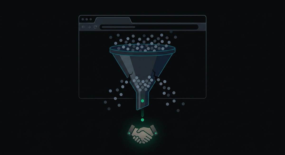
You open your analytics and the numbers look okay. A few hundred visitors last month. Maybe a few thousand. But the phone isn't ringing, the contact form is quiet, and you're starting to wonder if the whole website was a waste of money.
I hear a version of this from almost every business owner who comes to me with an existing site. They paid for it once, it "works" in the technical sense, and it produces nothing. The frustrating part is that traffic was never the problem. People are showing up. Something between arriving on your site and contacting you is broken, and in my experience it's almost always one of six things.
The good news: you can diagnose all six yourself in about 20 minutes, with free tools, and fix most of them without hiring anyone. Grab your phone and your laptop, open your own website like a stranger would, and run through this list.
Can a Stranger Tell What to Do Next?
Open your homepage and give yourself five seconds. If the single most obvious thing on the page is not a button or instruction telling a visitor what to do next, you've found your first leak.
Most small business websites I audit have a beautiful photo, a vague slogan, and then... nothing. No "Call now." No "Book a free estimate." No "See our menu." The visitor is left to figure out the next step on their own, and most of them won't. They came with a task in mind, hit a wall of ambiguity, and went back to Google to try your competitor instead.
Here's the test. Show your homepage to someone who has never seen it, count to five, and ask two questions: what does this business do, and what am I supposed to do next? If they hesitate on either one, so does every visitor.
The fix costs nothing. Pick the one action that matters most to your business. For a plumber that's a phone call. For a restaurant it's a reservation or the menu. For a lawyer it's booking a consultation. Put a button for that action at the top of every page, in a color that stands out, with a verb on it. "Get a quote" beats "Learn more" every time. One primary action per page. If you ask for five things, you get zero.
How Slow Is Your Site on a Phone?
If your site takes more than about three seconds to load on a phone, a big chunk of your visitors are gone before they see anything. Google's research found that the probability of someone bouncing increases 32% as load time goes from one second to three, and 90% as it goes from one second to five.
Testing this takes two minutes. Go to PageSpeed Insights, paste in your website address, and look at the mobile score. Not the desktop score. Most of your visitors are on phones, often on a cellular connection in a parking lot, and that's the experience that decides whether they call you.
If your mobile score is under 50, speed is actively costing you customers. The usual culprits are boring and fixable:
- Huge images. A 6 MB photo straight off a phone camera is the number one offender I see. Run your images through a free compressor like Squoosh and re-upload them. Most photos on a website should be under 200 KB.
- Sliders and animation plugins. That rotating homepage carousel loads a pile of code and almost nobody watches past the first slide. Replace it with one strong image.
- Too many plugins or apps. If your site runs on WordPress or Shopify, every plugin you've ever installed is probably still loading on every page. Deactivate what you don't use.
Do those three things and re-test. I've seen mobile scores jump 30 points from image compression alone.
Would You Trust This Website If It Weren't Yours?
If your site has no reviews, no photos of real work or real people, and no visible address, visitors have no reason to believe you're any good, or even real. According to BrightLocal's 2026 Local Consumer Review Survey, 97% of consumers read reviews for local businesses. Your visitors are looking for proof. The only question is whether they find it on your site or leave to look for it elsewhere.
Check your site for these, honestly:
- Real reviews with names. Even three or four, copied from your Google Business Profile with permission, beat a wall of anonymous praise. "Great service!!!" with no name attached reads as fake because it usually is.
- Photos of your actual work, team, or location. Stock photos of smiling models in headsets do the opposite of what you hope. People can spot them instantly, and they signal that you had nothing real to show.
- A physical address and service area. For a local business, hiding where you are reads as evasive. Put your address, or at least your city and the areas you serve, in the footer of every page.
- Anything with a number in it. "In business since 2011." "Over 400 kitchens renovated." "Answered within 2 hours." Specific numbers are believable. Adjectives are not.
This is the cheapest fix on the list. You already have the proof; it's sitting in your Google reviews and your camera roll. An afternoon of copying it onto your website can outperform any design change.
Is Your Traffic Even the Right People?
Sometimes the site is fine and the visitors are wrong. If you rank for phrases that curious people search instead of phrases that buyers search, you'll get traffic that was never going to become a customer.
Here's how to check. If you have Google Search Console set up (free, and worth the 10 minutes), open the Performance report and look at the actual queries bringing people in. A renovation contractor I looked at was getting most of his traffic from "kitchen design ideas 2026". Those visitors wanted Pinterest inspiration, not a contractor. The phrase that brings buyers is "kitchen renovation contractor Montreal", and he didn't rank for it at all.
No Search Console? Open an incognito browser window and google the phrases a paying customer would use: your service plus your city. If you're nowhere in the results, Google doesn't know that's what you do, usually because your pages never say it plainly.
The fix is less mysterious than SEO people make it sound. Give each main service its own page, and make the page title match what a buyer types: "Emergency Plumbing in Montreal", not "Our Services". Say your city and service in plain language in your headings and text. You don't need tricks, you need your pages to literally contain the words your customers search.
How Many Hoops Does Someone Jump Through to Contact You?
Every extra field on your contact form, and every basic question your site refuses to answer, costs you leads. Someone ready to reach out is at the most fragile moment of the whole process, and friction kills them off fast.
Walk through your own contact process on your phone and count the obstacles:
- Does your form ask for more than name, contact info, and a message? Company size, budget dropdowns, "how did you hear about us" — every one of those belongs in your first conversation, not on the form.
- Is your phone number visible and tappable? On mobile it should be a link that starts a call. If someone has to memorize the number and dial it manually, plenty won't.
- Do you give any pricing signal at all? You don't need a full price list. But "websites from $1,000" or "most bathroom renos run $8,000 to $15,000" filters out nobody except people who were never going to buy. Total price silence sends buyers to a competitor who at least gives them a range.
- Does anyone answer? Submit your own form. If the reply takes three days, the lead already hired someone else. Speed of response is part of your website whether you like it or not.
Is the Website About You or About Them?
Read your homepage and count how many sentences start with "we". If it's most of them, your site is talking to the mirror. Visitors don't arrive caring about your company history or your passion for excellence. They arrive with a problem: a leaking pipe, a slow business, an empty Friday night at the restaurant. The site that wins describes that problem in the customer's own words and shows the path out of it.
Compare "We are a full-service digital solutions provider committed to excellence" with "Your restaurant's tables should be full. Here's how we fill them." Same business. Only one of them makes a visitor feel understood.
Rewriting this yourself is doable in an evening. Take each page and flip the sentences: every "we offer X" becomes "you get X". Lead with the customer's situation, then present what you do as the answer to it. Keep the About page for your story; everywhere else, the visitor is the main character.
What to Do With All This
Run the 20-minute version: five-second homepage test, PageSpeed mobile score, proof check, incognito search for your service plus your city, contact walkthrough on your phone, and the "we" count. Write down what fails. Then fix things in this order: call to action first, contact friction second, proof third, speed fourth, then copy, then search. The first three are usually a weekend of work and they're where the money leaks fastest.
Most sites I look at fail three or four of these checks at once, which is why "we get traffic but no sales" is such a common story. None of the individual fixes are hard. They just require looking at your own website the way a stranger does, which is genuinely difficult when you've stared at it for two years.
Full disclosure, since I've been giving away the playbook: I build and fix websites for small businesses for a living, flat price, one week, and diagnosing exactly these problems is a big part of the job. So yes, I have an interest in you thinking about this stuff. But most of what's on this list you can fix yourself this weekend without paying me or anyone else a dollar, and you should. If you run the checks and want a second set of eyes on the results, my inbox is open.
Связанные проекты
Poulet Rouge
Создал полное цифровое присутствие для Poulet Rouge — сети ресторанов с 100+ локациями в Квебеке. Интерактивный локатор заведений, виджеты онлайн-заказов, калькулятор нутриентов и двуязычное SEO, которое реально ранжируется в Google.
RestoHub
Рестораны перестают терять 30% в пользу Uber Eats — они получают собственную систему заказов, меню, сайт и программу лояльности в одной платформе. Полноценный опыт уровня Uber Eats, но ресторан оставляет себе каждый доллар.